Select Sidearea
Populate the sidearea with useful widgets. It’s simple to add images, categories, latest post, social media icon links, tag clouds, and more.

hello@youremail.com
+1234567890
+1234567890
Populate the sidearea with useful widgets. It’s simple to add images, categories, latest post, social media icon links, tag clouds, and more.


Boštjan Kožuh
Last weekend I was enjoying a short holiday break visiting a friend in Croatia. Seeing many tourists enjoying the summer, I started to wonder how far in advance they were planning their holidays this year since COVID-19 changed our behavior in so many ways.
Personally, I am more spontaneous, and I’m making on the spot decisions for (mostly) shorter trips this year. But how about others? To answer this question, I turned to Skyscanner flight search data.
I investigated the behavior of customers from France, Germany, Ireland, Italy, Spain, and the UK on 30 most popular routes.
Read on to learn what I found.
By the way, we will use the same flight search demand data for practical cases and analytical exercises in Module 3 of our newly launched Diggintravel Digital Retailing Academy. In the academy, you will learn how to do these kinds of agile analyses on your own. This will allow you to fuel your curiosity with stories told by the data and then apply the learnings in practice.
It is always good to start with an overview on the numbers. As you can see in the image below, we are indeed searching differently this year – we seem to like longer trips more, but are planning them on shorter notice.

Average values of Days in Advance end Length of Stay for 2020 versus 2019
Whenever we see a number, we should try to understand it. Looking at averages is okay to get the first glimpse into a phenomenon, but averages hide the variability.
Is the result the same for all months this year? What about for all passenger segments? And routes?
There are many questions we can ask. Some of them we can think of right away, but the majority pop up spontaneously because of answers to previous questions.
Being agile in analytics is about being curious and trying to answer the questions that we didn’t even know we would ask.
I always want to see how the differences show up across segments.
Segments can be anything that makes sense – routes, passenger types, user countries, etc. In my example, I looked at segments of passengers, and the first glance at two simple radar charts confirmed that not all segments behave in the same way.
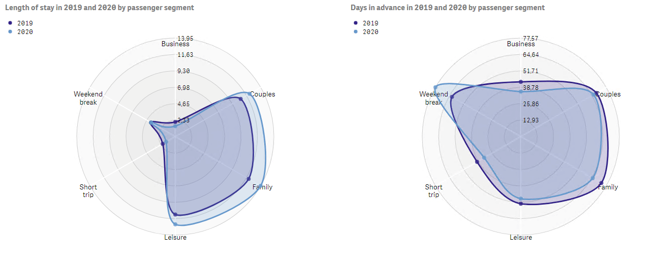
Radar charts showing how Length of Stay and Days in Advance by different passengers segments compare between 2020 and 2019
When it comes to trip duration, couples, families, and other leisure travelers indeed exhibit more interest in longer holidays. But on the other hand, short trips have become even shorter, and so have the business travel hops.
We can draw similarly interesting conclusions from the chart that shows the Days in Advance metric. We can see that the weekend break segment pops out from the others as travelers are planning such trips further ahead of time than last year – quite the opposite to other segments.
Examining trends is one of the simplest, yet most powerful ways of understanding changes in behavior over time. Either we compare one year to another across comparable dates, or we simply look at changes in the metric value, and we can quickly see how a phenomenon evolves.
I looked at several different trends to answer today’s questions. In the end, this is the one that sticks out with the most interesting story – it shows the changes in both metrics between May 11 (week 20) and August 9 (week 32) this year.
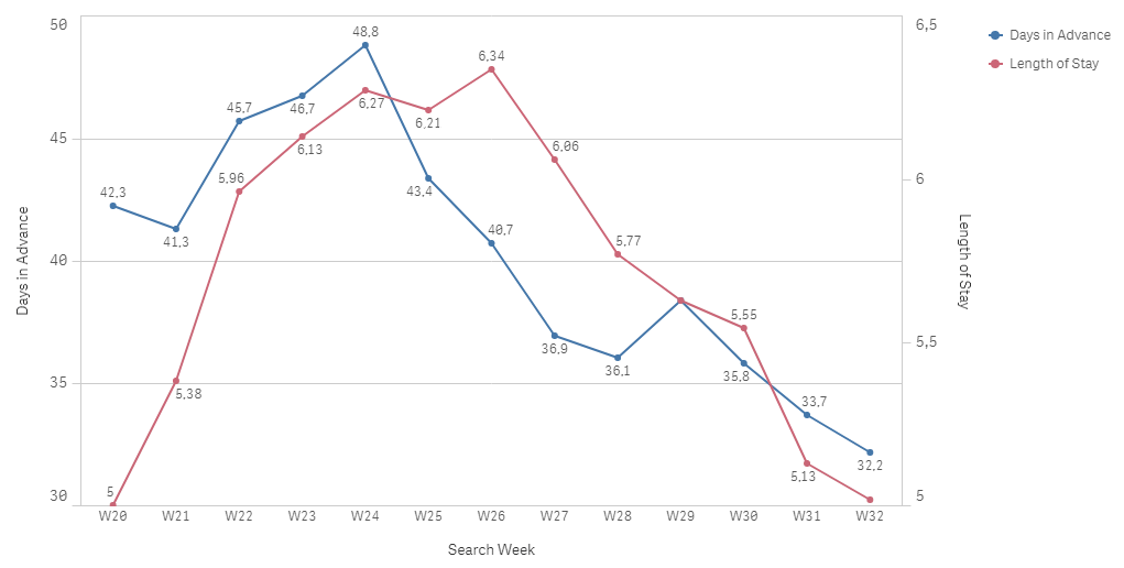
Days in Advance and Length of Stay metrics exhibit similar trends
We see that there was a peak for both Length of Stay and Days in Advance around the middle of the examined period. Since then, passengers have been consistently searching for ever-shorter trips closer to the search date.
Why is that? To find out, let’s do another analytical exercise.
Breaking down the data into smaller groups is called segmentation. As I mentioned above, this is an incredibly powerful technique for getting deeper insights into the overall data story.
One question I get asked a lot is whether segments are the same as clusters?
The concepts are similar, but we create them differently:
Segmenting is the process of putting items into groups based on similarities, and clustering is the process of finding similarities in items so that they can be segmented.
Clustering is a very common machine learning technique and can reveal groups that we might not be aware of.
In my exercise, I first wanted to see if there are groups of routes that exhibit similar behavior for the Days in Advance metric. As it turns out, there are.
This chart may seem complicated at first but is quite simple to understand:
My simple clustering algorithm found 4 clusters, represented by 4 colors in the chart. It also revealed another interesting pattern:
We are apparently becoming even more spontaneous (i.e., there’s a lower Days in Advance value) for routes where we were already spontaneous last year.
On the other hand, we’re taking more time to plan routes that we planned further in advance last year.
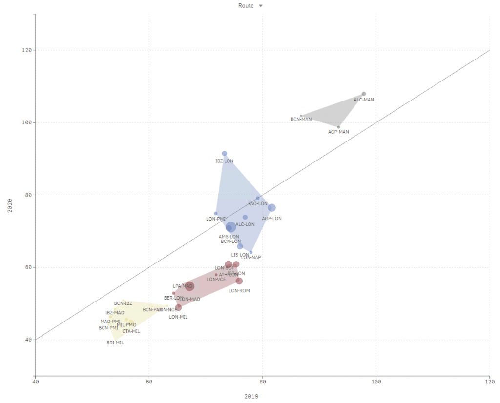
Using machine learning we found 4 clusters (marked by different colors in the above chart) of routes with distinctive changes in Days in Advance metric between 2020 and 2019
Boštjan is an agile analytics ninja. He has helped various international and travel companies uncover insights locked in their data and compete on analytics. He is a data expert at Diggintravel and mentor/instructor at Diggintravel Airline Digital Academy. He's always on the lookout for new areas for application of analytics and always excited to talk about BI. You can reach out to him via bostjan.kozuh@diggintravel.com or via LinkedIn.
Download PDF with insights from 55 airline surveyed airlines.
Thanks! You will receive email with the PDF link shortly. If you are a Gmail user please check Promotions tab if email is not delivered to your Primary.
Seems like something went wrong. Please, try again or contact us.


No Comments