
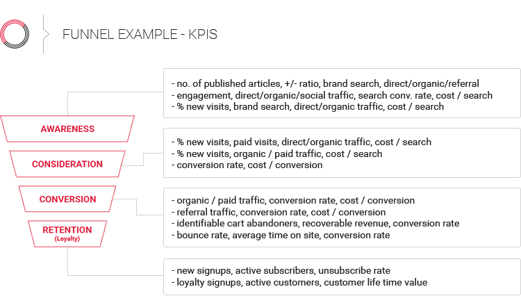

Lately at Diggintravel, we’ve been putting a ton of emphasis on that big strategic picture, especially when it comes to the exciting world of data science, artificial intelligence (AI) and new game-changing large language models (LLMs).
But at its very core, Diggintravel was crafted with a single mission in mind – to serve up practical, hands-on insights tailor-made for you, the airline digital professional. Today, we’re diving headfirst into the nitty-gritty of airline digital marketing, and guess what? We’re about to tackle what is probably the most important part of airline digital: airline booking funnel optimization.
And for that, I couldn’t find a better person than Joonas Leppävuori, Digital Product Manager at Finnair. Two years ago, Joonas was a participant in our very own Diggintravel Airline Digital Academy, where we delved into the core concepts of UX, digital optimization and experimentation together. Since then, I’ve been following his work closely and was thrilled to see that Joonas and his talented team at Finnair were putting these very same concepts into action, doing systematic airline booking funnel optimization and crafting exceptional digital products. I’m very happy that Joonas was willing to share some of their invaluable learnings with you.
Listen to the new episode of the Diggintravel Podcast to learn about Joonas and his airline booking funnel cases and his work at Finnair, or read on for key highlights from our talk:
And don’t forget to subscribe to the Diggintravel Podcast in your preferred podcast app to stay on top of the latest airline digital optimization, UX and CRO trends!
Finnair’s digital team made waves during the challenging COVID pandemic by unveiling a brand-new website. But here’s the kicker: they took a different approach compared to the usual airline playbook. Instead of embarking on a years-long, waterfall-style project culminating in a big-bang cutover, they opted for a far more agile strategy. Their secret sauce? It’s rooted in Conversion Rate Optimization (CRO) and experimentation concepts that brought about a paradigm shift in how they tackled this monumental task. Joonas described this process as an ongoing CRO loop.
I would say it’s an ongoing loop, and the reason we’re renewing all those steps is that our website is actually pretty new. I think we released the first version of the new website just for COVID, so it had a lot of MVPs.
We built MVPs, but now we have been improving those steps, step by step. So now I think we’re reaching the level where we want to be. The steps are looking good; every step is well thought and has meaning. We have removed some extra steps. So yeah, it’s been a journey. When we have reached the end of the funnel, when we have renewed every step, I don’t know what to do next. Maybe I’ll go back to flight selection and have a couple of cups of coffee and sit down with the designers to think where to start.
The approach of constructing and launching MVP-like features for various airline booking funnel pages, followed by a period of collecting data and user feedback for subsequent rounds of optimization, is not a common one in the airline industry. Typically, for most airlines, a freshly rolled-out website signifies the finish line rather than the starting point for optimization.
Over the past two years, Finnair’s digital team has continuously improved upon this initial website through an agile, data-driven process. They methodically optimized one booking funnel page at a time, from flight results page to passenger info page and seat selection page. Each step presented unique UX and conversion challenges that required dedicated focus. Extensive A/B testing and analysis was done to validate and measure the impact of incremental changes. According to Joonas, by constantly renewing these booking steps, Finnair has elevated their site to a more polished state with carefully refined user flows.
Here are some key highlights from some of their booking funnel optimization projects. Listen to the full podcast chat for more details on each of these cases.
The flight results page is where airlines need to strike a balance between presenting as much information as possible so people see that there are a lot of options, content, different flights and connections – but on the other hand, you don’t want to overwhelm them. Filtering and sorting functionalities can be used to help with that.
Finnair’s new flight results page lacked filters and sort options initially. Though conversion rate increased without them, substantial user feedback showed a lot of users requested these features. People wanted more control over their flight search results.
At first we realized that we had some filters earlier, but nobody was using them, so that was a thing, like, “Okay, why is that so?” So we removed them. We added our own logic, which improved the conversion quite a lot. But then we started to get a lot of feedback, like, “Where are the filters? I want to do sorting by myself.
The Finnair digital team added back filtering and sorting functionality after benchmarking metasearch sites and adjusting for Finnair-specific features. A/B testing validated that the changes did not negatively impact metrics.
Yeah, we did A/B tests. All the major changes, we do A/B testing and validate it first. We needed to read the feedback because there was a lot of it. People were really waiting for those filters to come back, and then on the other hand, the earlier solution was looking very good from a numbers perspective. It was a bit of a balance.
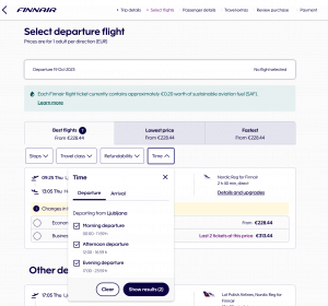
Source: finnair.com
Seat selection was the most recent case (published a couple of weeks ago) of Finnair’s airline booking funnel optimization. Finnair’s seat map and selection redesign focused on reducing the number of clicks needed for users to select seats. The old vertical layout required extensive scrolling and tapping for multiple passengers. This is how Joonas explained the key goal of optimization:
I think we started from the issue that the amount of clicks a user needed on the page was way too much. Let’s say there was a party of five selecting flights. You needed 14 clicks to select for five people for just one flight. That was the first pain point. I said we needed to reduce that number. Now a group of five only needs 5 clicks, so that dropped dramatically.
The second thing was that the price communication needed to be clearer. As you mentioned, it’s a complex product. It’s a flow of its own, so we need to be very clear on the pricing – how much does each seat cost? And then of course, going through the differences. With just a quick view, you need to see the differences – where are the good seats, where are the less expensive seats and so on.
Accessibility and ease of use on mobile devices was another focus point. This is why the digital team decided to shift to a horizontal configuration, allowing users to see the full cabin at once and easing mobile use.
All of this needs to work on mobile. Mobile screens are small. They are getting bigger, but still small. And my thumb is big, so if I try to click a seat on a mobile screen, I try to select four seats at the same time. That was one thing. We changed from a vertical approach to a horizontal approach because that allows you to scroll and you can see the whole width of the plane at once.
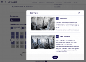
Source: finnair.com
Finnair found their passenger info page was lengthy, with many required fields that created friction in the booking flow. To improve this, they removed irrelevant fields, especially those not needed on mobile. The login was simplified so logged-in users can skip filling in details. Sections are now hidden until relevant, creating a progressive disclosure effect. These changes aimed to reduce the cognitive load and make the page appear shorter.
Yeah, the passenger details page can get very long and very exhausting. It’s kind of a mood-killer for many. You see a lot of information that needs to be filled. We felt that it has to be short, and even if it’s not short, it needs to look short. So we hide sections that are not yet relevant. It has its own flow within the page. And then we did remove a few things. We may not need a phone number for the second passenger or email for the third one, or an email for an infant. So I think there was a lot to improve, which made sense for everyone when we started to think about it.
Like with seat selection, improving the mobile experience was one of their top priorities.
Quite often we need to start from the mobile, especially on the passenger details page. So many fields to fill. We’ve started with making the login super easy, so that’s already all the passengers that are traveling by themselves, just by logging in, you don’t need to fill anything. So that’s one step already. For the other passengers, when removing those extra fields, especially on mobile, you don’t need to fill them. So that’s super nice for them.
Like you mentioned, on desktop there’s a little bit more patience, maybe. People see the whole page at once. They can go and copy/paste information from another page and so on. But yeah, I think mobile has been in the focus for quite some time, and it really still is, as conversions still are lower. But then on the other hand, people are browsing flights more and more on mobile.
According to Joonas, this passenger page now ranks highest in their booking flow UX surveys. Despite the page having a high exit rate historically, users find the simplified experience easy to complete. By removing unneeded friction, Finnair reduced dropout rates on this critical page.
The last point was what really impressed me about their booking funnel optimization process. Finnair is not only collecting feedback on website and mobile user experience; they are benchmarking the performance of each funnel page in detail with booking flow UX surveys.
At the end of the funnel, when people have booked something, we have this survey. In the survey we ask general questions like, “How did you like it altogether?” But then we also ask step by step, “How did you like flight selection?”, “How did you like the ancillary page?”, “How did you like the seat step?”, “How did you like the passenger information page?”
UX surveys are just one part of a constant loop of researching user behavior, soliciting feedback, analyzing data, forming hypotheses, designing enhancements, validating through testing, and repeating. Each step of the complex booking journey presents unique challenges that require cross-functional collaboration to align concepts across different touchpoints.
Digital optimization is a balancing act between removing excessive friction for users while still presenting necessary information and functionality. But Finnair’s case demonstrates how airlines can leverage an agile, iterative approach to incrementally improve the digital customer experience.
If you want to learn from leaders like Joonas about how to optimize airline digital experience or want to be the first to know when our next Airline Digital Talk will be published, please:

No Comments