Select Sidearea
Populate the sidearea with useful widgets. It’s simple to add images, categories, latest post, social media icon links, tag clouds, and more.

hello@youremail.com
+1234567890
+1234567890
Populate the sidearea with useful widgets. It’s simple to add images, categories, latest post, social media icon links, tag clouds, and more.


Iztok Franko
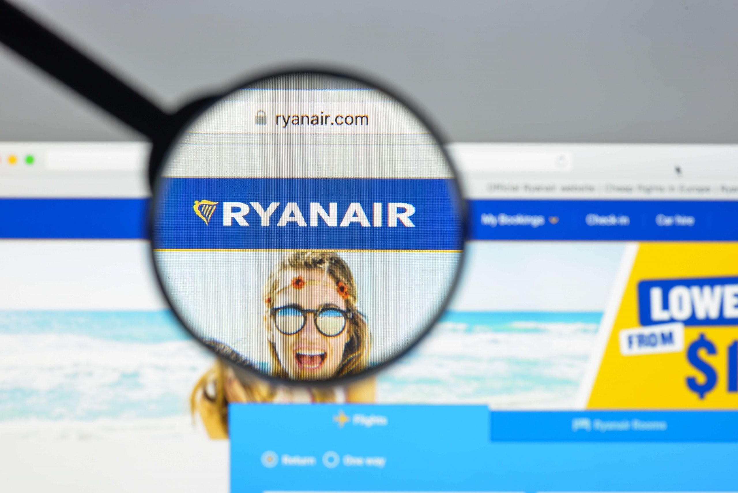
Remember the times when you almost felt like Ryanair didn’t want you to make a booking with them? You landed on their website and it felt like a maze that you couldn’t get out of unless you bought at least five add-ons – and you almost needed sunglasses because the banner ads were flashing so brightly from all sides. Those were the times when you could be pretty sure that Ryanair UX research was nonexistent.
Now, you were not the only one feeling that way. In 2011, Ryanair’s website was ranked last (yes, LAST among 51 websites) in a UK website usability study. Saying Ryanair UX design was not very user-centric was probably an understatement.
Actually, Ryanair was not hiding that, according to Colin O’Brien, Head of QA:
The website traditionally would have been described as being an obstacle course in the past. We really didn’t pay much attention to that up until the advent of Ryanair Labs three years ago. The idea was that our fares were so cheap that people would effectively crawl over broken glass to get them anyway.
Well, the users weren’t having it anymore.
While for some airlines, user experience is almost the primary focus (I wrote about UX at Virgin Atlantic recently), Ryanair understood they needed to make huge strides when it comes to their digital user experience. Their online bookings were just not growing fast enough anymore:
What we found was, we had reached a ceiling where we couldn’t poke through the 80m passenger mark, and then that provoked an evaluation around our offer as a whole. What came out of that specifically was that our digital offer was quite a bit behind competitors and so, there was a pivot towards putting together structures and systems that would allow us to deliver a better digital product to customers, put things in front of them in a better perspective, better presentation, an easier website to navigate, better apps and so forth.
And oh boy, did they invest in the digital user experience! Recently they opened their third IT and innovation hub, the new Travel Labs, in Madrid, with a staff of 50 and plans to expand up to 250 people who will work on digital programs.
While what they’re doing with innovation hubs is really impressive, I was even more curious about what they actually did to change the website so much. How are they becoming more user-centric? You know me – I want to see how real digital pros do it in practice.
So, I started to dig(g)in and I found the pro and talked to him 🙂
First, Rui is really passionate about UX and Research. This is how he describes what he does on his personal website:
I implement research methodologies & best practice into the digital development process and oversee and manage the quantitative and qualita tive aspects of user research to ensure best in class user experience is achieved.
But before going into the meat of his work, I wanted to know how he started. What was the path that led him to his current role as Head of Ryanair UX Research?
I started my career in the field of physical education – my choice at the time because I have always loved sports and actually practiced Olympic Handball for 13 years. So I took my Bachelor’s in Basic Education Teachers – Branch of Physical Education. My goal was teaching groups of children and inspiring them to love sports as I do.
Along the way, I missed the technology in my day-to-day work. I attended some minor courses, but that wasn’t enough. So, I decided to go back to college and redirect my career to a field where I could work closely with groups of people and understand the user’s needs. Luckily, in early 2012 I ran across a Master’s [program] in Human Computer Interaction that was going to kick off in my city and I didn’t hesitate in applying.
On my Master’s, I had the opportunity to work closely with a few companies and actually build prototypes based in user testing and user-centered design for them. This was great; in each project I would be even more certain that user experience is what I want to do for a living. Understanding the user’s needs, designing for them and solving usability problems is something that I really love doing. My goal in UX is to help people truly enjoy the world around them.
In 2014 I decided to move from my home country – Portugal – and came to Ireland. I joined Ryanair, and 4 years later I’m still working at Europe’s favorite airline, and what a ride it has been since I joined.
Once I understood Rui’s path and how he got to Ryanair, the next logical question was what he does in his current role:
My role as Head of Ryanair UX Research & Usability is divided into two different streams: Product and Strategy.
Regarding the Product stream, we manage a team of product designers when there is a need to conduct research. At Ryanair we empower designers to conduct research whenever necessary, due to the structure of the Digital Experience team – PODs (1 UX, 1 UI, 1 Product Owner and 1 Business Analyst).
Every time there is a need for one of these PODs to conduct research, the UX Research team is the one that provides assistance. We create the research brief with the methodologies that best suit their needs. However, the designers are the ones that actually conduct the research. Our role is to ensure that the end product is fit for purpose vs. identified business and user objectives.
Ryanair is a very fast-paced company, and this structure is the one that provides us the best results. It frees the UX Research team to work on the “hot topics” for the business, but always overseeing activities relating to user, business research and validation strategies.
Regarding the Strategy stream, my team clarifies product direction through the use of research and other tools and techniques to inform product strategy and execution. We are subject matter experts on product strategy for the design and digital teams based on competition and research.
Rui’s job sounds quite interesting, right? What interested me is how his team is integrated into the overall product and ecommerce process:
UX Research sits under the Product Design team, which sits under the Digital Experience team. Under the Digital Experience team also sits the Ecommerce team, Product team, CRM and the Personalization & Optimization team.
We work in PODs and UX Research works across all PODs. Luckily, research is something very established here at Ryanair. Our designers and other stakeholders see the value of it and are very conscious that it is something that is part of the process. For example, everything is tested on the UX stage and UI stage as well.
My team is very lucky because Ryanair understands the value of research in the whole design process. We know that this doesn’t happen very often in other companies.
Wow! Seems like Ryanair really took their digital experience and user research goals to heart. Certainly a big change compared to their early days. But I still wasn’t completely satisfied. Once I understood their organization, I wanted to know what UX research activities they actually do:
We use a wide variety of methodologies, but it all depends on what the objectives are. Here at Ryanair we typically do:
- User Testing
- Contextual Inquiries
- Job to be Done Interviews
- Competitor Reviews
- Benchmarking
- Surveys
- Intercepts
- Polls
- Shadowing
- Diary Studies
- Card Sorting
Like I said, it all depends on what we want to find out!
One of the challenges I see when it comes to airline ecommerce is how to scale things up – and Ryanair certainly does things on a large scale. They use specialized user testing service provider solutions to do user testing at scale, and fast. I asked Rui about how many user tests they run:
All our designers (20) and researchers (2) test everything on both the UX and UI stage, so you can imagine that the number of tests per month is very big.
Quantity is one thing, but how do they do it fast? How does such UX research and usability testing fit into the rapid, agile development cycle at Ryanair Labs?
That’s the whole reason why we go with remote unmoderated tests with usertesting.com. We couldn’t do it any other way due to the fast-paced environment that we live in here at Ryanair. We need quick turnaround times, and we don’t have the luxury to wait days for the result. However, we are also conscious that there are cons to doing remote unmoderated tests vs. face to face. After weighing the pros and cons, we think we got to a good compromise.
One thing still boggled me. If they do so many user tests, how do they analyze the results at such a scale?
That’s why we empowered designers to conduct these tests. This way we can do more user tests at the same time and reduce the analysis time vs. if my team had to do it all.
Do they test their website only, or do they user-test the competition as well?
Depends on the project. My team typically always test a new functionality vs. our current website/app vs. a couple of identified competitors.
Now you can probably understand how important user research is for Ryanair’s digital team. But as a conversion optimization enthusiast, I had to ask one last thing.
What is the one user research activity that Rui thinks is the most useful for the conversion optimization process?
I don’t think there is one activity, but a combination of activities that are useful for the Optimization team. The majority of these activities identify what issues our customers are facing when interacting with our platforms. It could be user testing, interviews, surveys, etc.
But if I had to choose one, I would say the benchmark we do every month across our top markets and all platforms (Ryanair.com, Ryanair Rooms and App). We measure how our customers rank our different aspects: “Satisfaction,” “Ease of use,” and “Barriers to book.”
This tells us what impact the new designs have on our customer base. The output gives us a clear idea of how our customers rank Ryanair platforms, and the real issues they are facing when using them.
So this would probably be the one activity that most helps the Optimization team. Based on the input, Optimization picks up the identified issues and tries to mitigate them.
I am passionate about digital marketing and ecommerce, with more than 10 years of experience as a CMO and CIO in travel and multinational companies. I work as a strategic digital marketing and ecommerce consultant for global online travel brands. Constant learning is my main motivation, and this is why I launched Diggintravel.com, a content platform for travel digital marketers to obtain and share knowledge. If you want to learn or work with me check our Academy (learning with me) and Services (working with me) pages in the main menu of our website.
Download PDF with insights from 55 airline surveyed airlines.
Thanks! You will receive email with the PDF link shortly. If you are a Gmail user please check Promotions tab if email is not delivered to your Primary.
Seems like something went wrong. Please, try again or contact us.


William
one of the classic questions is “the UI might be nice, but what revenue does it bring in”? …what was the outcome for Ryanair (ie: improvement in conversion)?…