Select Sidearea
Populate the sidearea with useful widgets. It’s simple to add images, categories, latest post, social media icon links, tag clouds, and more.
hello@youremail.com
+1234567890
+1234567890
Populate the sidearea with useful widgets. It’s simple to add images, categories, latest post, social media icon links, tag clouds, and more.


Iztok Franko
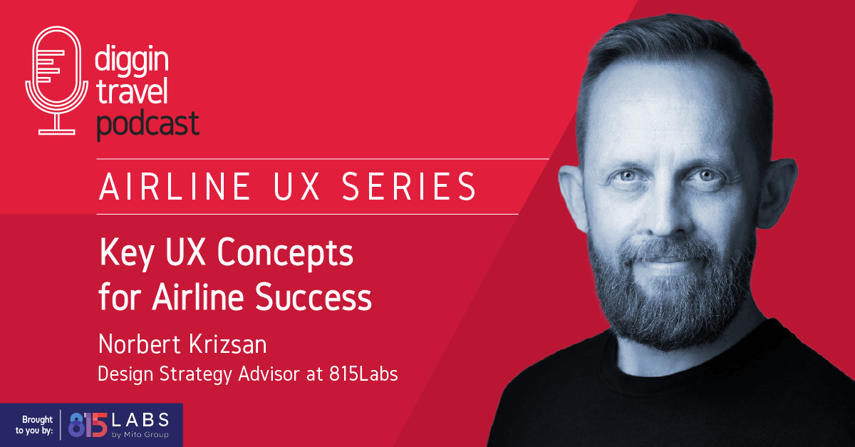
We’re excited to kick off a brand-new series, the Airline UX Series, in partnership with 815Labs. After our successful Airline Leaders Series where we explored high-level trends with digital leaders, we’re shifting gears to focus on something more practical – the complex world of airline UX. This series will delve deep into the heart of user experience design, breaking it down from all possible angles with some of the industry’s brightest minds.
In this first episode, we’re setting the scene by exploring the key concepts of airline UX: what it truly means, what is the difference between terms like UX, CX, and UI, and why understanding the business side of things is crucial for UX designers. We’ll also discuss how UX has evolved over the last 10 years, the process of building airline UX from scratch, and how to effectively test whether it meets customer needs.
I couldn’t be more thrilled to have Norbert Krizsan as our first guest. Norbert is not only an experienced design strategy advisor and UX lecturer but also helped shape the entire structure of this series. With a wealth of experience spanning roles like UX designer, UX lead, head of UX, and head of design ops, Norbert has guided airlines and numerous other big brands in crafting their user experiences from the ground up. He’s the perfect person to help us set the stage for the series. And as we move forward, you can look forward to conversations with leading airline and travel UX experts who are redefining the passenger experience.
Listen to the new episode of the Diggintravel Podcast to discover essential insights on airline UX, the role of design in business strategy, and how to build user experiences that truly resonate with customers. Or, read on for key highlights from our talk with Norbert:
And don’t forget to subscribe to the Diggintravel Podcast in your preferred podcast app to stay on top of the latest airline digital strategy, marketing, data science and AI trends!
Before diving into the core concepts of UX, CX, and UI, it’s important to understand how our guest, Norbert Krizsan, found his way into the world of UX design. For Norbert, it all started with a passion for problem-solving.
I love puzzles. As long as I remember, I’ve loved puzzles. It’s not really the solution that excites me, but the road to figure out, to dissect, to analyze what is the problem and how the puzzle works. The excitement and the flow of solving the puzzle is something that I really love.
This fascination with puzzles eventually led him to UX design, where he found a unique way to apply his analytical mindset. But for Norbert, it wasn’t just about creating elegant designs – it was about using design as a tool for business growth, a key theme throughout the whole chat.
This is something that really interested me for quite a while: how businesses can be realized and how these businesses can grow through design.
Before digging deeper into the challenges of UX, let’s start with a basic definition: What is UX in the first place? Norbert offered a broad, generic perspective to set the foundation:
User experience is when (someone) experiences while interacting with (something) that is made by (someone). This is very general, this is very generic.
To make this concept more tangible, Norbert provided an airline-specific example:
If I make an airline example, if I want to travel from Budapest to London and I make a booking through the Wizz Air website that is made by Wizz Air and owned by Wizz Air, now we are talking about the user experience – something that is much more tangible.
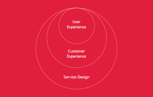
In the context of airlines or any other industry, Norbert’s definition clarifies that UX encompasses how a person experiences something designed by someone. However, many (including myself) often mistake this broader definition for something narrower, confusing UX with the user interface (UI), which is actually just a subset of UX. UI focuses on specific interactions, like using a booking engine to complete a task. So, how are these two related? Norbert explains:
It’s a subset. You can book through agents, you can book through the kiosk. You can ask your friend to book for you, and you are going to have an experience… We have to dig deep and we have to identify, through the whole booking experience, from the moment when you realize “I am going to fly to London,” to arrive into London, that’s a whole journey. What are the parts that are not aligned with our business expectation? What are the touchpoints where we can improve the conversion, where we can improve the brand experience, where we can improve the in-flight experience? We have to understand and identify this, and the UI, the IBE, or the mobile application is just a very narrow subset of it.

While UI is a crucial element of UX, it’s just one piece of a larger puzzle. The ultimate goal of UX is to make every interaction with the airline as smooth and satisfying as possible. It’s not just about functional elements, like finding the right button or filling out a form; it’s about creating an overall experience that users find accessible, operable, and engaging. As Norbert puts it:
To make everything accessible, operable, findable, and finally, when everything is working, make it delightable.
In my experience in optimization projects with airlines, the focus often starts with UI-level questions like, “Should this button be red or green?” or “Should the booking form have three fields or five?” But when we dive deeper into user research, the feedback usually goes beyond UI elements and points to broader customer experience challenges. This is where I see the real difficulty: we need to move beyond surface-level fixes and address the underlying issues that impact the entire airline experience.
Norbert offered an interesting analogy to reflect this:
How I view this feedback and how I view the interaction between the ecommerce management or the marketing management or the customer support or any insight coming from the call centers, these are basically insights on how to change the music notes on the sheet. But the user interface is the music. You need good musicians, you need experts who can translate those notes to the user interface, because that’s what the user or the passenger or the customer is going to hear, is going to interact with.
No matter what you’re making, it needs to provide value for the business. The approach to UX design has undergone a significant shift over the past decade. Whereas once the mantra was to prioritize the user at all costs, the focus has gradually moved towards balancing user needs with business objectives. Norbert reflects on this evolution:
This is something that has changed over the years in terms of how user experience and user experience design is viewed in a company. In the early years, 10-15 years ago, it was everything about the user, everything about the customer, they are always right. Funny thing is, “The customer is always right” is not the whole sentence. The whole sentence is, “The customer is always right in matters of taste.”
While putting the user first is still important, there’s now a stronger emphasis on making sure these efforts also help grow the business:
In the past five years, it shifted; yeah, it’s user-centered, it’s human-centered, but our biggest role is to make the business run and grow the business while still focusing on the customer, still focusing on the user, the human being that gives us the money in exchange for providing the goods and the services.
Does this mean that UX designers and strategists have to move even closer to the business? Norbert suggests that understanding the business side is essential:
It would be careless not to understand what makes money for an airline or what makes money for any commerce company. Or it would be very irresponsible to say that the biggest source of our revenue on the digital channels is not that important to optimize the conversion.
If UX designers need to be closer to the business and understand how to solve business problems, does this mean there are more design people sitting at the big table?
I’ve seen a lot of people get to the big table in the past 10 years and be booed out of the room very ungraciously. But what I see nowadays, and I hear it in the conferences more and more often, is that people with good design sense and good understanding of what the user experience is, what the customer experience is, how the different fields of design work, ranging from interaction design to service design or business design – with business background and understanding how the business operates and how it grows – get to the big table. And now they provide value.
Norbert has had the unique experience of both building airline UX from scratch and optimizing existing ones. Building from scratch isn’t something airlines do often, so I was curious about how he approaches this challenge.
The very first thing that you have to have is a plan, and you have to accept that that plan can go wrong and will go wrong at any time. But have a plan… if they’re a solid crew and you have a plan, you want to do it right, then you can work on the next task: how you are going to create something that is unique, that is not something that is always the same thing as that one but with a different look, a different color, a different name. This is how we started to work on PLAY (PLAY airlines). They had a basic idea, basic expectation on where they should move forward. We created the plans, we created quite a few concepts on how they would be represented on their digital channels.
With the plans and concepts in place, the next crucial step was ensuring the experience resonated with passengers:
The big part of that was the experience: how the passengers would feel when they arrived at the site. That was very, very critical, because everything else, if you understand how IBEs work and how you should design and code IBEs, it’s not rocket science. But you have to nail the feeling, you have to nail the tonality, the genre of the music. You have to nail it really right so that it resonates not only with the brand, but everybody.
That last part got me really intrigued. How did they figure out what “genre of music” the airline’s customers wanted to hear?
We talked to the stakeholders, how they view this business endeavor, why they want to do it, and what kind of people they are. Because they are going to be the role models for the whole company. Everybody’s going to look at them. This is something that many of the leaders don’t understand – that how they behave, everybody will behave the same way as they do. If they have any kind of flow, everybody’s going to inherit that kind of flow and that behavior.
So we talked to them, and many of the recurring themes were that they understand that this is very serious business and they understand how this business operates, but they were very playful – they were such a joyous group of people that we really enjoyed talking to them and working with them. We found that what they want to do is to make this site, make this brand very, very successful, and that ambition, we took it as DNA and tried to put it into the aesthetics of the site itself, to be playful, to be fun but still serious, still understand that this is something really very critical.
We understand that many of the people fly for the first time, so we hand-hold them at places where it should be supported, but we give them as much freedom as we can with very light illustrations, a more relaxing and calm tone of the user interface when it’s possible. So that’s how we started to approach it.
The process started with understanding the brand persona and the brand DNA, and then embedding these elements into all designs, communication, and interfaces.
Listen to the full podcast chat with Norbert to gain detailed insights into:
To dive deeper into these topics, make sure to listen to the entire podcast. You can access it through the embedded podcast player in this article or on your favorite podcast platform.
If you want to learn from leaders like Norbert about airline UX, digital optimization, data science, and AI, or just want to be the first to know when our next Airline UX Series interview will be published, please:
I am passionate about digital marketing and ecommerce, with more than 10 years of experience as a CMO and CIO in travel and multinational companies. I work as a strategic digital marketing and ecommerce consultant for global online travel brands. Constant learning is my main motivation, and this is why I launched Diggintravel.com, a content platform for travel digital marketers to obtain and share knowledge. If you want to learn or work with me check our Academy (learning with me) and Services (working with me) pages in the main menu of our website.
Download PDF with insights from 55 airline surveyed airlines.
Thanks! You will receive email with the PDF link shortly. If you are a Gmail user please check Promotions tab if email is not delivered to your Primary.
Seems like something went wrong. Please, try again or contact us.


No Comments