Select Sidearea
Populate the sidearea with useful widgets. It’s simple to add images, categories, latest post, social media icon links, tag clouds, and more.


hello@youremail.com
+1234567890
+1234567890
Populate the sidearea with useful widgets. It’s simple to add images, categories, latest post, social media icon links, tag clouds, and more.


Iztok Franko

Welcome to the fourth deep-dive in our Airline UX Series in partnership with 815Labs!
This episode is particularly special, as it’s the first time we’ve taken the Diggintravel Podcast on the road, recording in the vibrant city of Belgrade. This setting allowed us to connect more personally with our guest, gaining deeper insights into his work and experiences.
Our guest, Srdjan Prokić, Head of Ecommerce at AirSerbia, shares the compelling journey of building a new airline mobile app from scratch. In the first three episodes, we featured UX experts, leaders, and lecturers, but for this episode, we wanted to bring in a leader whose background and role are not specifically in UX. Srdjan’s work, however, requires him to deal with and manage UX in practice, offering a fresh perspective on tackling complex UX challenges in an airline environment.
Srdjan discusses how, by collaborating with a UX agency, they addressed complex airline mobile UX challenges. He explains their process for bringing in external UX expertise when it wasn’t available in-house—including finding the right partner, building trust, and establishing a true partnership to ensure the agency understood their unique airline needs. Srdjan also highlights the importance of collaborating with real users throughout the design process to create a seamless, intuitive mobile experience that meets both business goals and customer expectations.
We did a special video recording in a Belgrade studio for this episode of the Diggintravel Podcast! You can watch the full video here or listen to the podcast format on your favorite podcast platforms. Or, read on for key highlights from our talk with Srdjan.
Podcast also available in podcast format here:
And don’t forget to subscribe to the Diggintravel Podcast in your preferred podcast app to stay on top of the latest airline UX, digital strategy, marketing, data science and AI trends!
When I first met Srdjan in 2019, he was leading Air Serbia’s mobile app project, a greenfield initiative at the time. Fast forward five years, and he has progressed to become the Head of Ecommerce, overseeing a much broader scope of responsibilities while still prioritizing the importance of UX and mobile innovation.
In his role as Head of Ecommerce, Srdjan oversees a dynamic team that manages Air Serbia’s digital channels, from website and mobile app development to performance marketing and digital analytics. He detailed how his department collaborates cross-functionally to tackle the unique challenges of airline ecommerce while maintaining a strong focus on UX.
We are dealing with a lot of development, specifically for our website and mobile app. We are also responsible for acquisition, like performance marketing, meta searches, working with OTAs, also indirect online sales. Doing a lot of support for the users of the digital channels. Also, since recently, we are having analytics inside of our department, specifically digital analytics. And of course, we are working cross-functionally with a lot of colleagues from PSS, from finance, when it comes to the payment. So it’s very interesting and challenging.
We have nine people in our ecommerce department, but like you said, we are working closely with the PSS, which is a little bit bigger department and also has a lot of knowledge about the digital, about the reservation system, everything that we need to connect to. And that is affecting basically the booking process, check-in process, and other things that we do on the web.
But regarding the UX, actually, there are three people that are working on this area. I have one product manager in my team who is working on the website and also on the mobile app, and I have one person who is doing support work, like helpdesk, because one of the things that, for example, we did in our mobile app is we have direct communication channels where you can send us feedback, and we talk directly to the customers.

Source: Air Serbia website / media
While Srdjan’s role encompasses many areas of ecommerce, the UX aspect of his work is particularly relevant for this Airline UX Series. One of the most intriguing elements he shared was how Air Serbia leverages their mobile channel to engage directly with users, creating a valuable feedback loop for continuous improvement.
People are reaching out to us and asking all kinds of questions. Maybe something is not clear, maybe they have a problem or a challenge, whatever. And why we did that is because even though we have a great collaboration with our call center and people from social media, they’re also feeding us with a lot of info. We wanted to shorten this communication cycle.
We are basically getting a lot of feedback from people. Usually working in an airline on so many areas, you don’t have a lot of time maybe to interview people on a daily basis, which is very important. We are doing that, but on a much slower condense.
Air Serbia’s approach goes beyond simply engaging with users—they’ve turned their mobile app into a tool for recruiting real users to participate in UX projects. Involving them in testing new designs and features ensures that the final product meets customer expectations.
I think users really love it because they usually don’t expect that they will get an answer so quickly, and when they do, they are very open to continuing communicating. And actually, we use this channel to hire some users for testing when we have some design before it goes to production. Of course, we always do some usability testing with the Figma applicable prototypes. So this channel actually serves us to hire the real users.
Basically they reach out to us, we help them to solve some problem, and then we ask them, at the point when we have some new feature which should go to development, if they would be willing to do usability testing with us. They’re usually very happy to do that.
The main focus of my conversation with Srdjan was Air Serbia’s mobile app and their journey to achieving impressive results with many valuable UX learnings. However, before diving into the details of the app, I wanted to understand how Air Serbia approached a key challenge: finding the right UX partner when the necessary design capabilities aren’t available in-house.
What is very important is that during the RFP process, we had some tasks that they needed to do, and we picked one who showed us that they have a great process. They were using design thinking, and they presented how they would approach all the things that you need to do in UX, from the workshops with stakeholders, discovery, tree maps and things that you would do, card sorting. We knew, “Okay, we can teach these guys the industry; they will teach us how to do UX.
Another crucial factor Srdjan emphasized when selecting a UX partner was ensuring long-term stability. High team turnover, common in the IT industry, can disrupt progress and create inefficiencies. To foster a strong partnership, they prioritized finding an agency with a stable team that could retain knowledge over time.
What was also very important for us, because we wanted to create this partnership, not just to hand over requirements, you return designs, we give you a few comments, you maybe fix something, and that’s it – that usually doesn’t work really well. So we were also looking at if this potential partner has a high fluctuation of people, which is very common in the IT industry but can be a big problem. We need a partner to keep the knowledge they have in-house, or we’re going to have to teach them over and over again, which can take a lot of effort.
Designing for mobile presents unique challenges compared to desktop or website interfaces, especially in the airline industry. Srdjan highlighted how the limited screen space on mobile devices forces teams to prioritize simplicity and rethink how they present information, often requiring collaboration and negotiation with internal stakeholders.
The biggest challenge, I think, is when you design for the desktop, even on the 14-inch laptop, you have a lot of screen space and you can put a lot of information there and people will be able to understand it and to read it, if you’re not using a lot of airline lingo. But on mobile, that’s very different. You need to simplify things as much as you can. That was a big challenge because, for example, we are used to presenting a lot of airline-specific info to the passengers, like maybe fare basis, which is really not important for the end user. They don’t care about it. But for us as airline people, we are used to thinking about this, and for us this is important info.
When we created these simplified screens, we also had to negotiate and convince our colleagues who were also stakeholders in this process that this is a good approach. And of course, doing usability tests with the users and being able to show them the feedback was also very helpful.
Simplifying mobile UX: the case of the histogram
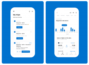
One standout example of Air Serbia’s mobile-first UX thinking is the redesign of the flight results page. While most airlines use a ribbon on desktop and mobile to show prices for a few days before and after a selected date, these ribbons often clutter the screen with too much information, such as dates, prices, and currencies. To simplify this on mobile, Air Serbia introduced a histogram—a clean visual representation of price comparisons for up to 20 days around the selected date.

Source: Air Serbia and kroonstudio
This approach provided passengers with more information in less space, allowing them to easily find the best price. The results were significant:
50% of the people who make a search move the histogram and go to another date and then continue booking.
The histogram’s design was developed in collaboration with their UX agency.
When we understood that we had this opportunity, we explained this to our design agency; they came with a visual solution and presentation, and then we tested it with the users.
The team set realistic tasks for users, such as searching for the cheapest price with flexible dates, to ensure the feature aligned with real-life behaviors. Early feedback revealed areas for improvement, and the design was refined through multiple iterations.
Of course, we got some feedback. In the first attempt, it wasn’t perfectly designed. But then we of course always do some rework, some redesign, before we go to production. When it went to production, I think it worked perfectly.
By the time the feature launched, it required minimal changes and has since delivered exceptional results.
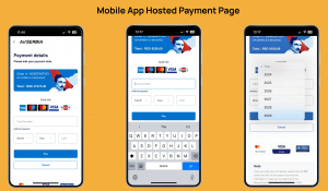
Redesigning the payment page was one of Air Serbia’s most impactful mobile UX projects. Payment pages often have the highest drop-off rates in the booking process, even for customers who are ready to purchase. Air Serbia approached this challenge by identifying unnecessary complexities and reducing the number of input fields.
The payment screen was specifically interesting because these are the people who found the flight, who added ancillaries, everything. They just needed to pay to get the service they want, and we were very interested in why we were losing so many people.

Source: Air Serbia presentation
Analytics and user interviews revealed that passengers often made mistakes while entering sensitive payment data, leading to declined transactions. Others abandoned the process entirely, sometimes switching to competitor platforms. To address this, the team focused on simplifying the process by removing unnecessary fields.
We learned that for a bank to process a transaction, they only need the card number and CVC number. They don’t even need expiry date or the name on the card. This is completely unnecessary data that can be useful maybe for fraud checks and prevention.
By reducing the required inputs from 12 fields to just 4, Air Serbia made the payment experience faster and more user-friendly. Of course, this redesign wasn’t implemented without testing. The team worked closely with payment gateways to ensure seamless integration while maintaining the look and feel of the app. The results were remarkable:
Our acceptance rate for payments in the mobile app is top of the industry, about 90%, which is really good. It means that people who attempt to pay actually succeed.
This project exemplifies how Air Serbia combined data-driven insights, technical collaboration, and user testing to improve a critical step in the booking journey.
If you want to learn more about Air Serbia’s journey, including their future plans for mobile, make sure to listen to the full podcast chat.
If you want to learn from leaders like Srdjan about airline UX, mobile, digital optimization, data science, and AI, or just want to be the first to know when our next Airline UX Series interview will be published, please:
I am passionate about digital marketing and ecommerce, with more than 10 years of experience as a CMO and CIO in travel and multinational companies. I work as a strategic digital marketing and ecommerce consultant for global online travel brands. Constant learning is my main motivation, and this is why I launched Diggintravel.com, a content platform for travel digital marketers to obtain and share knowledge. If you want to learn or work with me check our Academy (learning with me) and Services (working with me) pages in the main menu of our website.
Download PDF with insights from 55 airline surveyed airlines.
Thanks! You will receive email with the PDF link shortly. If you are a Gmail user please check Promotions tab if email is not delivered to your Primary.
Seems like something went wrong. Please, try again or contact us.


No Comments