Select Sidearea
Populate the sidearea with useful widgets. It’s simple to add images, categories, latest post, social media icon links, tag clouds, and more.

hello@youremail.com
+1234567890
+1234567890
Populate the sidearea with useful widgets. It’s simple to add images, categories, latest post, social media icon links, tag clouds, and more.


Iztok Franko

Welcome to the third deep-dive in our Airline UX Series in partnership with 815Labs!
This series is all about bringing you firsthand insights from the most passionate UX leaders in the airline and travel industry. Our guest, Martyn Reding, Director of User Experience Design at Expedia Group, definitely fits that category. With experience in managing Digital Experience spanning from Virgin Atlantic to travel giant Expedia, as well as design agencies and even building his own platform for developing future UX leaders, Martyn knows the industry inside out.
In this episode, he shares his insights on building high-performing design teams, the insource vs. outsource question, key learning from building an experimentation program, what metrics to use, and how AI is shaping the future of design.
Listen to the new episode of the Diggintravel Podcast to discover how to build great UX and design teams, tips on experimentation, and the impact of AI on UX design. Or, read on for key highlights from our talk with Martyn:
And don’t forget to subscribe to the Diggintravel Podcast in your preferred podcast app to stay on top of the latest airline UX, digital strategy, marketing, data science and AI trends!
Martyn’s LinkedIn bio reads, “I build happy, high-performing design teams”—a simple yet powerful statement that truly embodies great UX. It intrigued me to the point that I couldn’t resist starting with the question: Is it really possible to have both a happy and high-performing team?
I think that those two things are connected to one another. I don’t think it’s possible to have a sustained amount of high performance from a team if the team is not happy. Anyone can drive a team very hard for a short period of time and get a short, focused chunk of work from them, given enough energy, but in order to keep that running and to keep it high performing indefinitely, you need to make sure that people are comfortable. You need to make sure people are happy.
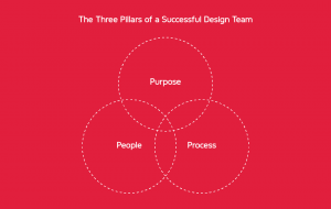
So, how do you build a team that’s both happy and high-performing? Martyn shared his framework, focusing on what he calls the “3 Ps” or pillars of a successful design team:
I think for me, the best framework and the best way to approach it has been to focus on three things and to dedicate energy and time to each of those three things.
The first one being people: getting the right people, getting those people into the right roles, building good cross-functional relationships, and like I said, ensuring that people are happy, comfortable, that they feel safe, they feel protected, and they feel interested. That’s the first and foremost, people.
Second one would be purpose: setting out a clear vision for where you’re going and articulating that vision in as many formats and as many forums as possible. Overcommunicating, really, just to ensure that everyone is clear about why they’re doing what they’re doing and where it’s going so that they can all make good decisions and they’re empowered to get behind a mission, to take the right steps towards that and figure out what those steps are themselves.
And then thirdly, process. This comes last in the series, but it’s about removing blockers, it’s about smoothing out the edges for your team so that they are enabled to move at speed and with as great efficiency as possible. So it’s really those three things. It’s what I call the 3 Ps or the 3 pillars. People, purpose, and process.
In-house vs. outsourced design: Choosing the right approach for your team
Martyn noted that the landscape for building design teams has shifted significantly post-COVID. Pre-pandemic, tech teams were expanding rapidly, backed by stable institutional investment. Today, however, airlines and travel companies face a more cautious environment, focused on doing more with fewer resources. In this context, while external consultancies have their place, Martyn sees a strong case for fostering internal capabilities as a way to build resilience and long-term value:
The model for fostering internal capabilities – this is firmly proven out. Having a base of institutional knowledge I think is vital to an organization’s success. A team of in-house designers, researchers, engineers is good for executing, it’s good for optimizing, but I think what’s equally important is building design and product leadership at senior levels so that you can ensure that the people who are within the team are given the right structures and support and given the best chance of success and are able to provide the absolute maximum value that they can.
So I would say that the very first step has to begin with installing the right leadership to help those voices at the top level. And then you’ll find when you start building those internal teams that it’s not just a cost saving in the short term, but also longer term, because it ultimately allows businesses to move faster when they are not dependent upon another organization.
Building an effective design team starts with strong leadership. Martyn, with his extensive experience in training designers to become leaders, emphasizes the importance of understanding business goals alongside user needs. This mindset shift is crucial for designers, as it moves design beyond pure creativity to something more strategic. For Martyn, this is where the distinction between design and art comes into play:
I believe that design is a response. Art is an expression. It satisfies the artist’s needs or desires and provokes a reaction. But design is a response to unmet needs, and those are needs of the users and the business.
We are not artists; we’re employed by businesses to fulfill a function, and for whatever reason, I think that gets lost in many designers and they feel that they are there to represent the user. And actually, I disagree with that. I think you’re there to represent the user and the business in equal measure.
Martyn believes that for designers to thrive, they need to be deeply connected to their organization’s strategies, goals, and language. Understanding the motivations behind business decisions not only makes designers more effective but also helps them align their work with the company’s direction. Good design, he argues, can’t flourish in isolation—it requires strong support from across the organization:
I think it’s very important for designers and people in the UX community to learn how to speak the language of your organization so that you can communicate the value of what you’re doing and ultimately gain support for your ambitions and for your work.
I don’t think good design can exist in a vacuum. If you took the best designers in the world and you dropped them into a company, that doesn’t mean that that company is going to be producing the best design in the world. In my experience, at least. I think good design needs good tech, it needs good product management, it needs good strategy, it needs good marketing, good sales, etc., etc., etc.
At Diggintravel, we often emphasize the importance of experimentation and a data-driven approach to marketing, UX, and optimization. Hearing this from a design leader like Martyn, however, brings a unique perspective. Martyn has built an experimentation program within an airline environment, drawing from his experience as Head of Digital Experience at Virgin Atlantic.
Martyn shared his perspective on the evolving role of testing, emphasizing that experimentation shouldn’t stand alone but should complement both qualitative research and analytics:
I have seen shifts back and forth over the course of my career in how much emphasis should or shouldn’t be put on testing. There’s certainly a lot of value in it, and I think it should be an equal balance. I think if you’ve got good qualitative research and you’ve got good analytics, having a good stream of optimization, a good stream of experimentation is the perfect supplement to that.

Choosing the right metrics is crucial when testing, especially to identify friction points or unmet needs—those moments when users may be searching for something they can’t easily find. Martyn highlighted some valuable metrics that go beyond the basics, offering a more nuanced view of user behavior:
I think it really depends on what you’re testing. I think a lot of value can be drawn from some of the smaller metrics, like dwell time, the depth of scroll, the amount of loop – so if someone lands on one part and then goes backwards a step and then lands on it again and does a number of loops like that – these things can indicate searching. I think you’re always seeking out some sort of indication of when somebody has not found the information that they need and they’re hunting round for something. Those kinds of metrics I think are really interesting.
And then on a longer scale, anything that indicates loyalty. So if you have a loyalty scheme, like a point scheme, how many people are clicking through and signing up for that afterwards? How many people are redeeming, like earning, and how many people are burning those points? How many people are logged in versus how many people are logged out. All of those kinds of things can help you build up a picture, and the more data that you can ascertain, the more potential learnings there are. I don’t think an experiment needs to just be A or B; I think it can be any combination of things to test a hypothesis.
The key to effective experimentation lies in starting with a solid hypothesis, one built on data, research, or observed user behavior. As Martyn explains, this foundation helps guide the testing process and ensures that each experiment is purposeful:
That’s really the most important thing with any thoughts or plans or ideas around experimentation: Do you have a solid hypothesis? Is there something that has indicated a potential opportunity here? Have you seen behavior in the analytics, have you seen something else happen in the marketplace, have you got verbatim feedback that has led you to believe that this version or that version or those combinations of versions might perform more effectively for users? And if you’ve got that good hypothesis, then that’s really what you’re testing against. You’re looking to disprove a hypothesis.
Finding the right balance: Blending qualitative insights with quantitative data
To gain a full picture of user behavior, it’s essential to balance quantitative data with qualitative insights. Quantitative research can show what users are doing, but as Martyn points out, only qualitative research can reveal why they’re doing it:
The more of an understanding and the more of a picture you can build up about your customer base and their behaviors and their needs and their attitudes, the more effectively you can create something that is standout, the more effectively you can gain market advantage. And you’re not going to do that purely with quantitative. It has to be a balance of quantitative and qualitative. If you’re doing a test – let’s just say hypothetically it’s an A/B test and you’ve got a good hypothesis to believe that “this way of structuring our pricing is clearer and gives people more confidence,” and you experiment with it and you get some results, and they’re interesting. You still don’t have a “why.” You’ve only got a “what.” You can see what people are doing, but you don’t know why they’re doing it. That’s why qualitative is so important and balancing the two is really important.
When experimentation isn’t approached strategically—without purpose, research, or the right balance of quantitative and qualitative insights—the results can be chaotic. This lack of cohesion can lead to a mishmash of ideas, as Martyn explains:
You can see this in travel companies, you can see this in ecommerce companies. You can see when people don’t have a good balance of qualitative and quantitative because their sites and their apps are just a mess of ideas. There are a thousand different messages all shouting at you, all trying to hurry you up, and they don’t really have any sort of cohesive experience that makes you feel good. And it doesn’t give people confidence, ultimately. You might win some short-term campaign, you might see some benefit there, but as a long-term brand building, it’s not an effective approach.
Listen to the full podcast chat with Martyn to gain detailed insights into:
To dive deeper into these topics, make sure to listen to the entire podcast. You can access it through the embedded podcast player in this article or on your favorite podcast platform.
If you want to learn from leaders like Martyn about travel UX, digital optimization, data science, and AI, or just want to be the first to know when our next Airline UX Series interview will be published, please:
I am passionate about digital marketing and ecommerce, with more than 10 years of experience as a CMO and CIO in travel and multinational companies. I work as a strategic digital marketing and ecommerce consultant for global online travel brands. Constant learning is my main motivation, and this is why I launched Diggintravel.com, a content platform for travel digital marketers to obtain and share knowledge. If you want to learn or work with me check our Academy (learning with me) and Services (working with me) pages in the main menu of our website.
Download PDF with insights from 55 airline surveyed airlines.
Thanks! You will receive email with the PDF link shortly. If you are a Gmail user please check Promotions tab if email is not delivered to your Primary.
Seems like something went wrong. Please, try again or contact us.


No Comments