

There are four crucial things that the best travel websites do better than the competition. You need to “nail” them to improve conversion rates and increase online sales. These 4 things are the core of every travel site’s online booking process.
So you’d be well advised to make this work or all other activities in your E-Commerce strategy on your travel website will fail. Or at best, produce less than optimal results.
So what are these 4 guidelines to increase your online sales?
#1 Simplicity
#2 Killer Search Box (booking form)
#3 Top performing Search Results Page
# 4 Transparency
Simplicity is a general guideline and the No. 1 rule to apply to all ecommerce businesses and websites. You need to apply simplicity along with the other concepts explained in this article as combining all of them will provide optimal results.
Less is more! Or, as Steve Krug, the author of “Don’t Make Me Think” (the Bible of website optimization), puts it:
When I look at a Web page it should be self-evident. Obvious. Self-explanatory. I should be able to “get it” – what it is and how to use it – without expending any effort thinking about it.
Marketing people are always tempted to put as much information as possible in front of their visitors. You made the effort and paid the bucks to get them to your website with your campaigns; now it is time to tell and show them everything. In addition, you want to show them the hottest promotions, new products and top travel destinations, and latest social media campaign – all this with flashy rotating banners. Wrong!
The number one reason and use case that most people come to travel websites is to search for and find the best travel deals.
They want to find deals for airline tickets, hotel rooms, vacation packages or car rentals. Therefore, you should do everything possible to support this use case. All other information is secondary and can be shown to the user at the proper time and within the right context. Reduce clutter and keep one focus.
That’s why in this article, we focus on the two main steps of the booking process: the search box and the search results page.
One of the best travel websites that has really pushed simplicity to another level is hotel metasearch site Trivago:

All you see on their website is the booking form (at least above the fold). Google figured it out, and Trivago applied the same search principle to hotel bookings. Once you start typing in the search box, additional relevant information is presented and the user is intuitively taken through the search process without much thinking. Simple and very effective. They show you the promotional messages and special offers later, once the user has taken their preferred action. In most cases, these promotions (via dynamic remarketing, email campaigns, etc.) occur after a user either abandons their site or completes the booking process.
Swiss.com (Swiss Airlines) is another good example of clean, simplistic design. The structure of the homepage is classic for an airline, containing a booking form, menus and promotional info. The menus follow the phases of the customer journey (book, prepare, fly, explore), and all other information is easily accessible.
The best part of the design is in the booking funnel, in the Search results display (explained in more detail in the next paragraphs), where users can choose their ticket class (branded fare). Most airlines use complex matrix tables for fare options display; consequently, these are difficult to comprehend. However, Swiss.com uses a really simple, neat and transparent comparison of different features, once the user selects the cabin class:

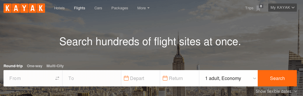
Kayak.com, one of the world’s biggest metasearch websites, is another good example. Enterprise.com, a car rental website, also uses similar simplistic, clear and transparent design.
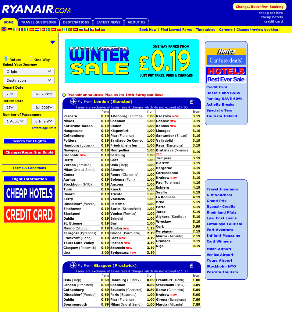
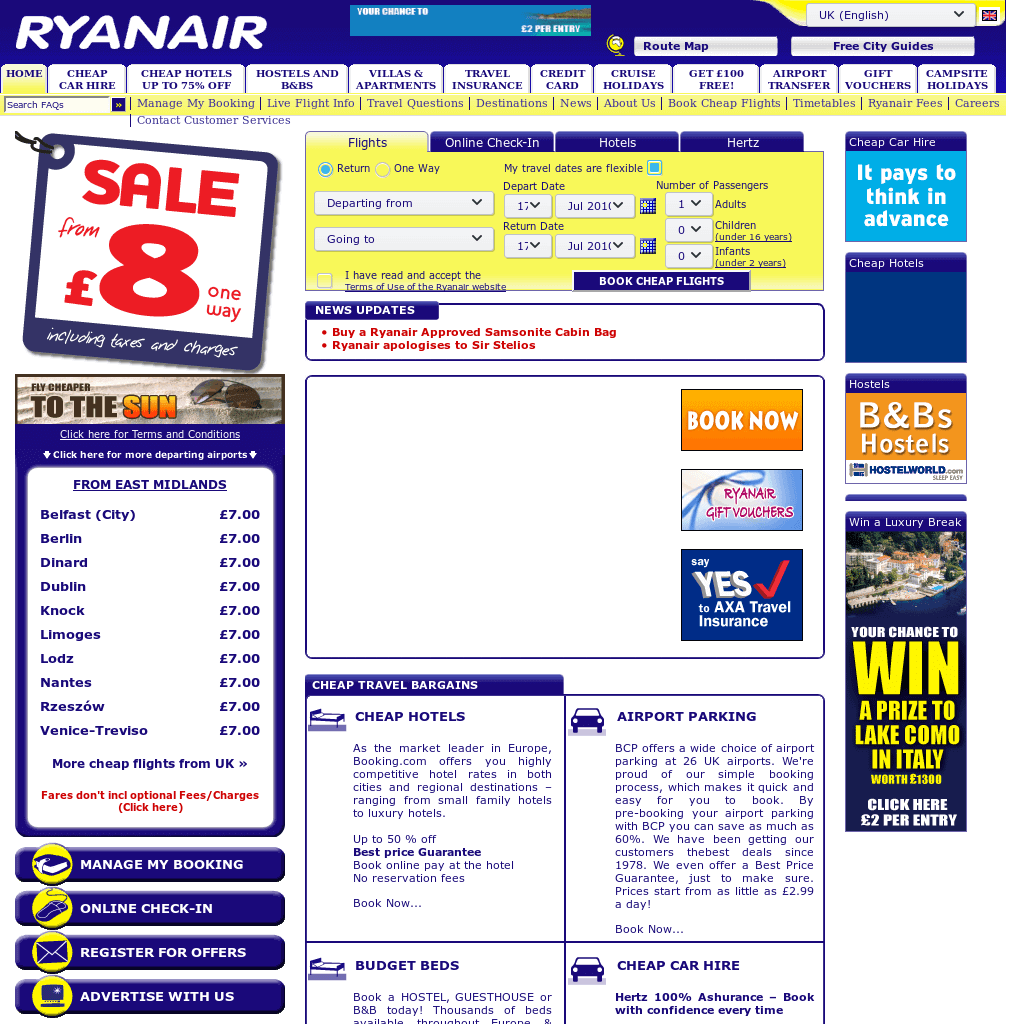
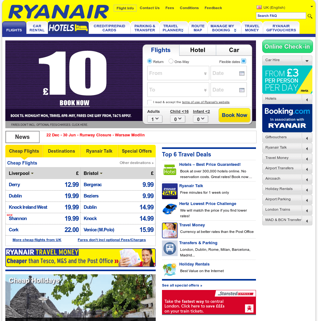
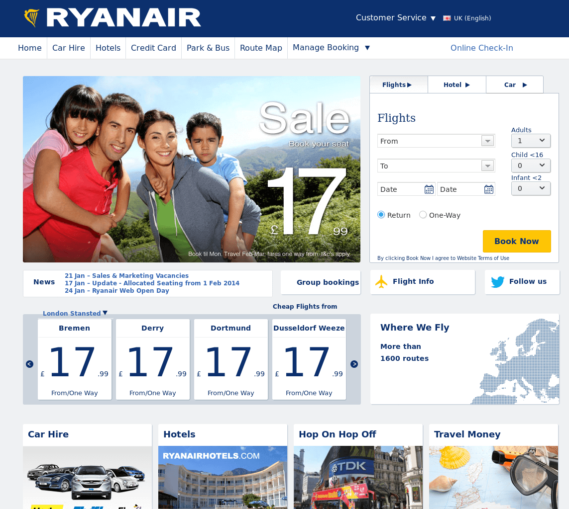
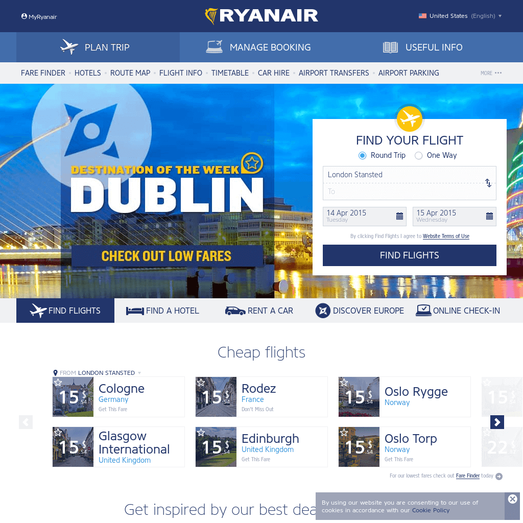
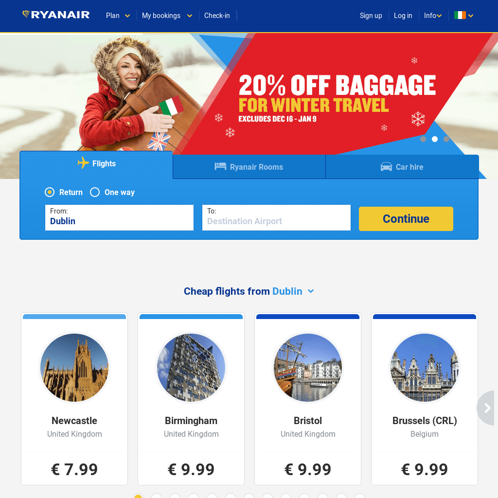
Even Ryanair.com, which used to force users to make many selections and “fight” through the booking funnel to final booking, recognised the importance of simple design. Just look at the “simplistic” transformation of their website:
Keep things simple, reduce unnecessary clutter and don’t make your users think.
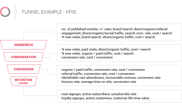
The search box is the main call-to-action (CTA) for all travel ecommerce websites. Getting people into search should be your main goal. “Cost per search” should be one of the more important key performance indicators (KPIs)”. It is the equivalent of getting people into your store to check out your products.
If users don’t recognise the search box on your travel website, you have a problem. If they find it confusing and difficult to use, again, that’s a problem. The same goes if they find other information and secondary calls to action more visible than the search box itself.
For most travel websites, the search box includes similar input parameters (destination, start date, end date). If you want to compete with the best travel websites, you should make the search process as simple as possible. Get your user to type the first word and ease him into the booking funnel. And again, don’t make your users think and work too much.
Kayak.com does a good job of keeping it simple and adding the options on the fly:
Enterprise.com uses an even more focused, simplistic – one input field shown – design:

On the other hand, the British Airways search box looks confusing, poorly designed and overwhelming:

If you really want to go in detailed UX analysis of various date picker options for your Search box, this Smashing Magazinne article is a great resource.
Always keep in mind that the search box is your key CTA. It should be the focus of your homepage and key landing pages. Make it simple, proactive and intuitive for your users.
For the best travel websites, the search results page is a make or break page. This is where the price is shown and where abandonment happens.
The search results page is the main page where people in the travel industry abandon online booking. According to the SaleCycle survey:
53% of people abandon their online booking process when shown the price.
For some travel websites and online businesses, the search results page is even more important than the homepage. Think of Online Travel Agencies (OTAs) or online car rental brokers that acquire most traffic through metasearches and other comparison sites. In such cases, users are redirected directly from the comparison site to the search results or other pages in the booking funnel via deep links. Thus, the search results page might be the customer’s first impression of the website, and the business’s first contact with the new user.
There are two crucial elements of the search results page that make the difference between a top-performing and less than optimized search results page. These two elements are the loading times of a search results page and the transparency on the search results page.
First of all, to get this straight, the performance and loading times of your whole travel website are important for several reasons. People don’t like slow websites, and it has been proven that slow websites increase bounce rates and decrease conversions. If you still doubt that this is the case, check out this Kissmetrics statistic:
40% of people abandon a website that takes more than 3 seconds to load.
Kissmetrics has a nice infographic and other statistics to prove the importance of your website’s performance. Apart from usability and website credibility, site performance also has SEO implications.
According to the above mentioned Kissmetrics study, every additional second that the page is loading has a direct negative impact on conversion rate:

Source: kissmetrics.com
If you run a travel ecommerce website (hotel, airline, car rental, OTAs, etc.), the performance and load times of the search results page should be your top priority. As explained above, the search results page is usually the first page in the booking funnel after the user performs the search, and it is where the price is shown. If metasearch traffic is a significant traffic source for your website, then it is even more crucial. In case of metasearch redirects, search results is the first page your users will experience.
You do not want to make users anxious and nervous before this critical step in the booking funnel by keeping them waiting too long. Slow performance makes your website less credible. Less credibility, more friction. More friction, lower conversions.
The travel industry is no exception. According to this report:
Slow loading times are the No. 2 reason for user abandonment in travel

Source: eyefortravel.com
The distribution and IT landscape in the travel industry is very complex. Products (flight seats, hotel rooms, cars), prices and availability are managed and loaded in several different systems and distribution platforms. This complexity brings performance challenges, especially for travel providers that consolidate and provide data from several systems and distribution platforms like GDS systems.
For traditional airlines (that sell interline and code share flights of their partners), OTAs or car rental brokers who consolidate many different suppliers, loading the search results page requires pulling a lot of data from different sources.
For some searches, complex and non-optimized queries can sometimes take more than 10 seconds to load the Search results page. This significantly increases bounce rate and decreases conversion rate.
Optimizing the performance of the search results page is usually a first and crucial step in the conversion optimization process for your travel ecommerce website. You can start the optimization process by implementing advanced monitoring and benchmarking to identify key bottlenecks and measure progress. For simple performance monitoring, Google tools and platforms (Google Analytics, Google PageSpeed Tools) are a good start.
Create special segments for all key pages in the booking funnel so you will be able to measure the performance of each page separately. For more advanced and complex diagnostics, you will need tools like Pingdom or GTMetrix. Split the load times into subsections (server response times, loading of scripts, images, and especially communication with back-end systems). Monitoring will allow you to identify bottlenecks in each activity and optimize search result queries and display.
Caching, optimization of scripts and queries, filtering and sorting of results, and limiting the number of displayed results are some of the actions that you can take. However, each case and setup of the search results page is unique.
To quote legendary management consultant and author Peter Drucker:
What gets measured gets managed
If you start measuring the performance of the search results page regularly and rigidly, good things will happen. You will start discussing the results with the development and IT teams, which will improve awareness of the importance of the Search results page load times. Once the tech guys start rethinking their code and optimize their queries with page load performance in mind, the battle is half-won.
My practical and empirical experience confirms that travel ecommerce website that systematically work on measurement and improvement of their key booking funnel pages improve conversion rate significantly.
Fast load times for your Search results page are crucial. Implement advanced measurement metrics and measure on a regular basis. Set the Search results page load time as a key KPI for your IT and development teams.
Being transparent to the customer should be your goal if you want to build trust and long-term relationships with them. Nobody likes the feeling of being tricked or charged additional fees for something unexpected. The travel industry used to be “fancy”; just think about experiences on airplanes in the ’70s or ’80s. You can even google pictures of airline experiences from that time period.
 With the emergence and dominance of the low cost airline business model and sharing economy models like Airbnb and Uber, the industry is getting closer and closer to classic retail.
Unbundling once-free services (bags, seat selection in the airline industry) and merchandising them as extra paid services (called ancillary revenue) is the usual model that “old boys” use today to stay competitive. The Search results page is the first page where unbundling happens, and this is where you need to start with transparency.
Most travel providers reduce the price of once-bundled products to stay competitive with pricing and cover the difference with ancillary revenue.
Digital savvy travel companies understand the customer journey and use marketing automation platforms to offer and sell the traveler the right product and service at the right time.
Travel customers can be charged for all kinds of different extra services like bags, seat selection, food and drinks (airlines), WiFi internet, paid breakfast, fitness and pool access (hotel), insurance, cancelation protection, and GPS (car rentals).
If you are transparent and good at communicating, offering these extra services can be good. Customers will understand this as freedom of choice. On the other hand, if this goes wrong, you will get disappointed customers that feel tricked. People are very sensitive about “hidden costs”. Hidden costs are one of the main “friction factors” that you need to address in your booking funnel.
Friction, or “the psychological resistance”, is basically what makes your website visitors scarred.
It is the reason why they don’t complete desired action (purchase) and a main conversion killer.
Start with a transparent display of prices and options. Be transparent when offering paid extras and services early in the booking process, usually on the search results page. Present extras as a choice. Don’t pre-select or hide them and make users uncover them later in the funnel (ex. at payment). Show features, not conditions.
Alitalia has a quite complicated set of conditions for purchasing an airline ticket without a bag (Economy Light fare) and a lot of small print about different prices if you buy the bags extra. People don’t like small print as it usually implies hidden conditions and charges.
Hidden charges are a conversion killer.
Also, Alitalia’s decision to mark the Light Fare conditions with a red (!) character and “ATTENTION” is not smart. These symbols mean danger; not a good sign to reduce friction in the purchase process.

Swiss.com is an example of the opposite. Clear, simple design, no small print and no warning text messages. They use a “Recommended” tag for assurance and trust. Additionally, they use the Information (i) symbol instead of Attention (!). They are an example of how the best travel websites perform transparent upsells.

A lot of car rental websites pre-select insurance protection (Full Coverage) products for users in the booking process. User testing sessions show that a lot of users don’t notice this pre-selection, and they only realise later on, at payment, that the price is higher than selected because the extra paid service was added. This makes people feel tricked and usually kills the conversion at payment.
Economybookings.com is one such case. I chose a car for 30.93 EUR and proceeded to the next step, where “Full Coverage” and two other extra features are already selected. The pricing isn’t transparent, as it isn’t clear whether this is part of the initial price or an additional cost.

On the next page it is evident that the Full Coverage and other features are an extra charge and the total price is way higher than my initial selection.

Rentalcars.com gives users a “choice” and makes them select either the Full Protection option or the option without it. The process is similar; they still highlight and expose their preferred choice with Full Protection. However, in this case the user is making the choice and no surprises occur at the payment step.

Upselling and cross-selling can be the difference between profitability and loss in the travel business. Be smart and transparent about it. Make users feel they have a choice. Don’t be overly aggressive at the beginning of the booking funnel. Use the post-purchase and pre-trip phase of the user journey for upselling and cross-selling. In travel, this phase is long – for leisure travelers, it’s usually 30-50 days from purchase to travel start date. This gives you a lot of time and options for effective upselling and cross-selling.
You can learn more about upselling and cross-selling in this blog.
Be transparent on your search results page and all other pages in your booking funnel. Understand your customer journey and use customer touch points to build trust. Use the after-booking part of the journey for upselling and cross-selling.
Before you go into detailed ecommerce and conversion optimization strategies for your online travel business, review and master the basics.
If you want to compete with the best travel websites, make sure the search box (booking form) and the search results page are optimized 100%. These are two crucial steps in your booking funnel.
Finally, use simplicity and transparency as general guidelines as you design your website and booking funnel.

Per Persson
Excellent article, thank you!
Iztok Franko
Thanks, Per! I’m really glad it adds value!